top of page
BUILDERS CORP.
Corlay & icearbr
none of your small business
Task 1


Welcome to Week 1 builders. For your first challenge this season we ask you to create a room inspired by the 1 prompt chosen for you below. Using your own personal technique and building style; design a vision that is sure to impress. We have randomly drawn names of builders that will face-off against each other for this challenge. This is intended to show us how your personality is reflected in your building designs. Good luck builders.
Room Size: Max. 8x8
none of your small business
CATCHY TITLE
This is your first panel, before you read your individual critiques. Please note we have each scored these builds and averaged them together to collectively decide your placement in the competition. Click on the images below to enlarge. Thanks for an amazing first week; we look forward to speeding this competition up after a slow start. We have a lot of work to do builders. Prepare your tool belts!
Seeing how this was the first submission we got, it completely floored me how good it is.
What do you think about this?
I really love the mixed furni lines she used to create these visual compositions.
Yeah the way she composed the colour tones together is fascinating. Thats a hard thing to do on habbo.
I had no idea there were that many fish furni in the hotel, mixed like that it looks really incredible.
I love how every furni is from a different line but it somehow fits in together so well.
The whole idea to do an outside market is a take I never would have thought of doing.
Yeah its a great take on the task. Thoroughly impressed.
Still not sure which furni she used in some of her stacks, that’s what impresses me the most because it still looks so good?
Ikr I have no idea what that fish net on the side is or the hanging fishies. Where did she get them?
I think it’s some sort of fishing rod? Anyway, a very unique design
Yea the whole room has an organic feel to it,and the use of various furni lines makes this that much more special. I really love this. I would also like to note the use of a more organic room shape, she didn't go for the safe square design.
That’s very true, a front-runner this week for sure.
She sure knows how to start this game with a bang.
True-Courage

Winner
Doglover53
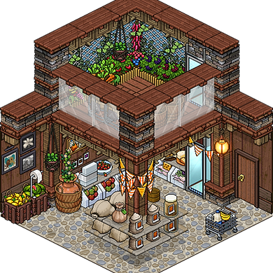
This is such a petite shop, it makes me smile.
Aesthetically, this is one of my favourite layouts this week; small space but it still looks so spacious?
The first thing I notice when I look at this are the old habbo photos used as pricetag. Thats adorable!
Pretty brilliant, I always enjoy when people can be inventive given what they have to use.
I enjoy the constructive details he created on the wooden panels around the room
I don't particularly love the cabin stone, but the divider stacked at the top is gorgeous, the whole idea to do an upstairs garden was ingenious as well.
Yeah adding a section in the shop where they grow fresh veggies is such a nice idea.
Overall this was a nicely constructed market, thought out in terms of movement and shop-ability if you will.
Yea, I just don’t understand the bright orange details he added to it. I feel like they’re not needed.
They tie it all together in my opinion.
Lastly, did you notice the shopping cart on the side? I love that.
It was a really nice touch, I like how he intertwined his stack to make it look like mesh. Good stuff.
CheekyFluffa

Though the intricacy is apparent, I would have loved to see some height to the room.
This is chaotic and messy, and uses the messiness to its advantage.
The bookshelf is beautifully crafted and shows her skill in stacking for sure.
If I divide this room into sections, i enjoy the way the furnis are combined and stacked but when you look at it from a general pov, the room pales in comparison with the others.
I agree, collectively it's just not as strong; though its not a bad design by any means.
I find that since everything in the room is leaning towards warmth and homeyess, the cobbled floor feels too cold for this type of room.
I think it was a good contrast, makes everything more visible.
I wish she pulled things closer together making this room more compact and petite. The decorative stacking is there it just needs to be constructed better less open space and more furni combinations.
For week 1, it was a solid attempt that will be redeemable in the coming weeks. Valiant effort and good building style went into it.
Hini

Damn this is huge. Not sure I like the dominating vertical aspect of this room
Definitely a risk, might not have paid off but a risk nonetheless
I applaud her for taking this theme in such a creative way but she lost it on the construction.
The idea was definitely thought out, in terms of structure; I find that the focus was more on making it a tree house rather than a store.
I love that greenery detail on the roof so much But it’s not enough to save the room especially considering the top heavy roof that's there.
The tree is definitely one of the best attributes; the combination of foliage is appropriate.
This room is lacking in the interior design. I feel like the bookstore section is lacking and basic.
I agree, that was her downfall. Had there been more inventive stacks and furni lines used, this could have come across a lot stronger. The grandeur and scale of the build should have been toned down especially since we were looking for a smaller build; hence the title and room size limit.
It pales in comparison to every other room.
There were so many ways this could have been heightened but it still stands strong individually; just maybe not for this task.
Winner

I’m impressed they went with a more minimalistic direction. I appreciate that.
It's very polished, I enjoy the contrasting furni tones; but the way in which he tied it all together with his palette on the walls is great.
Yea, the bricks and patterns on the walls are so good. They went with such muted colours, the walls are strong and striking but not overwhelming.
The bright take on the counter was great, so the attention immediately goes there. Nice touch!
Exactly, I'm not loving the floor detail, I think this would have achieved another level for me if it were maybe a cream colour? The shape of the room is nice though.
I do enjoy a room that's straightforward and constructive, it's pleasing to look at. Also the decision to do a cube shape here actually fits with the aesthetic of the room.
I agree, overall the palette, shape and details were prevalent. A few minor details I would fix but generally a very solid build.
When someone thinks pastisserie, everyone would think of pastels and frills and cute stuff, but he went for a more mechanical, metallic, masculine aesthetic.
It really paid off well.
I didn't expect this take on the theme.
Panday
The small food details were very appropriate, I'm glad he incorporated those into the room. Especially with the use of the glass counter.
Winner
,Informal

This is a cute take on the theme even though I feel like it could have been improved.
This has 12 different shades of brown, I would have appreciated it more if the palette was more cohesive and uniform.
I find it's pretty cohesive, the problem I have lies with the different furniture used to construct those stacks on the sides.
I actually like the various materials she used to make that construction.
I don't find the stacks are all that necessary, takes away from the main focus of the room. I wish some of the details were crafted better.
Those arches are so awkward and big to work with but they look like they belong there.
I agree, it also plays well with the palette she added in the counter and some of the details.
Overall this room has great construction but lacks the decorative aspect of it.
Yea, I think she will show us how she's able to balance both of those aspects in her next build.
I enjoy the extension and height of the room, some of the building style could be perfected.
Moonwalk

The exterior is ace, very nice job interpreting our task in a way that represents you.
This is such a strong piece. She really wanted to start this game with a statement that shes someone to be feared.
I couldn't agree more, I like how clean the build is. The white structure lets you see all the foliage.
Idk about you but my favourite part of this room is the way she used various textures and materials to create the structure of this building.
That's my favourite part as well. Nature inspired builds can be very boring. This shatters that stigma. The small details are gorgeous as well.
Look at that glass door, it's sooo cute!
I love the little lamp with the fairy lights and then the hanging sign, brilliant.
The set palette of the room is strong but it could have been even stronger if she avoided some of these really bright greens. Rooms look much better if you use similar shades of plants or in other cases, similar shades of wood.
Though I normally agree, it's nice to see the irripressible foliage stand out as the focal point. Especially with the white building; the colours pop.
I do love her decision on making this a building we view from outside instead of an interior design.
Pretty impressive, I can't wait to see more.
Winner
Lluvli

This is a really nice room but I feel like with some creative decisions, it could have been elevated to another level.
I agree, though some of the rudimentary elements of building a room are there; it could have been heightened by some more practical elements.
The main focal point of the room is the use of these amazing bright flowers, If she made the rest of the room in unsaturated muted tones, the flowers would stand out so much more.
I love the brick walls, for me I would change the brown blocks at the top; the shape is nice just the colour distracts from the flowers.
The one thing I don’t like here is that bar for the worker, it feels unrealistic and overwhelming.
It's not very practical, but its still cute. For me the 'box' in the middle is what I don't understand.
Even if construction-wise this room is not as elevated as some others, the mix of various flowers and colours is what saves this room.
The flowers are stunning, especially on that shelf. The mixture of colours and shapes are fascinating.
Overall it's a nice room that could have been better but i’m being really picky here.
Tarkovsky

Before we start I’d like to point out that he's one of the two people who gave us a room that didn’t fill the entire 8x8 limit. So props for that.
The shape of the room makes it more intimate and for this task it was very appropriate.
I enjoy the furni he decided to use here. It’s not easy to look through various furni and finding which ones fit in the “antiques” section.
There isn't a furni that I could point out that doesn't fit the theme. All very rustic and fitting.
They all look murky, dusty, and old. Even through all this mess you can tell how the room is organized. You can see the doorway, the walking path you take and the cashier. Thats impressive.
There isn't much I can say about this room negatively. It's practical, fits the theme and is very thought out. The furniture used is stacked nicely and the shelves he's made to hold these items are very creative.
The subtle wall furni he used around the room are noticed and appreciated.
I like how the wall edged up on the side, gives it a more organic feel. More interesting.
Great starting point for your builderscorp career.
Babycakes

This is such a cute messy room. It’s using the messines to its advantage and I love that. The furni selection is impeccable!
The small aisles were a nice touch, the ability to move around the room was something I was looking for. She nailed that aspect for sure.
The small details are inventive and nicely stacked and designed. Once again another build where all the integral elements are thought out effectively.
I wish she would have done something more with the walls and the construction of the room. Keeping it all inside a square is kind of boring.
For a starting build, it's not out of the ordinary to do a basic shape. People will get accustomed to what we're looking for. This is a good start.
Overall the furni decision is impeccable but she needs to think about construction too.
Though I agree, that will come as we progress.
Brilliant array of furniture, I especially love the cobwebs; unsure if the gender signs are intentional but I found it clever regardless.
Yea it looks like a messy maze where people have various paths to go around and browse, thats such a nice touch.
Winner
Thanks for an amazing first "week" please proceed to the
Progress page
to see your individual placements.
bottom of page