ATTIC
ATTIC
Week 1
Welcome Builders

Welcome to Week 1 of Builders Corp. 4.
For your first task we require you to conceptualize an original theme that will be used to highlight your construction of an attic.
Please note, your theme can be as unorthodox as you deem necessary.
If you have any questions on how to submit your builds, don't hesitate to reach out to us.
cover photo built by tallmolly08 (.COM)

Congratulations
..Raymond
Congratulations Builders! You have successfully completed your first task. The level at which we are playing is pretty remarkable. You are all exceptional builders and if this week is only a fraction of what you're capable of doing. We're going to have a great season. Please don't be intimidated or upset with your placement this week. The slate gets wiped each week and you have another chance at working your way to the top. Please see the progress page for your individual ranking. Thanks!


odeyasH
The shape and textures you worked with are very fitting for this task. The combination of stone and wood hues work well with the decrepit aesthetic the build has to offer. The details are laid out quite well. There is no misunderstanding, this is quite clearly an attic! I love the addition of the safe hidden in the wall. The placement of the finer details work well with the shape of the room. Allowing us to see how methodically everything is placed. Not too cluttered. Well done.
An outstanding opening display of your skill in this competition. A huge fan of the organic-ish shape and the restraint in palette. You managed to convey your idea quite well in a very proportionate showing, keeping an eye on composition and flow. Visually and conceptually strong. Welcome to the competition.

C0RPSES

Jumanji! I’m quite impressed by your ability to recreate such an iconic movie moment. Your thought process is quite creative. This shadow placement in this build is far superior to most of what we’ve seen this week in that regard. You used lighting to highlight a section of your build and still tell the entire story through the use of the background. Genius. The way you shaped the room and cut the walls to show the interior and exterior as well as the rafters was a good decision. This is a very powerful first impression. I hope everyone is taking notes. Good stuff!
I think you have one of the strongest rooms this week. The .es players are showing no mercy. The way you’re playing with shadow and highlight is downright genius. We all know how hard it is to play with light on habbo and you’re making it look easy with this gorgeous room. With the highest of praises from me, welcome to the competition. I’m ecstatic to see what you do next!

GreenStripes

There are a lot of redeeming qualities in this design. The structure is crafted quite well, the items you used to clearly identify the room as an attic are apparent. What I’m having trouble with is seeing where you were uniquely inspired. This is textbook. I see an attic, I see an attic built well. I don’t see where you were able to add your individuality or original theme. Push your limits further than what you’re used to and you’ll be soaring through this competition. Thanks.
While I wouldn't call this particular room breathtaking, it has some strong ideas woven into it. I believe this lacks in vision and visual appeal, especially with how the attic is created. We need to see more individuality in your creations, something truly unique that solidifies your brand. I also believe the overuse of shadow in this case truly removes the appeal of the room. If you’re going to use shadows, use them with purpose to darken sections and highlight others to draw the eye in. The saving grace of this room is the quirky framing you did as an exterior around your attic. I’ve seen what you’re capable of and this is just a taste of it. Take risks, be bold and let the real you show in your creations.

Deathbrand

A minimal design that incorporates a full story. The layering you created with the floors, creating a staircase is very smart. You focused a lot of work on such a small aspect of the design that directly relates to everything we asked of you in this task. The rest of the room captures the less technical features of an attic. The study space is unadorned but still embodies a unique and compelling theme. Overall the details could be more prevalent but your approach was appropriate.
A very quaint and smart submission from you as expected. A creation full of color and life with a unique shape to it. I thoroughly enjoy your attempt on giving the room some dimension with the open stairs going down. Overall this is clean and safe. What I want to see from you this season is you taking huge risks giving us crazy rooms and ideas we’ve never seen before. Excite us if possible. Welcome back to builders corp.

janicetale

Methodical and inspiring representation of our task. Your use of lighting, casting shadows throughout the design (appropriately) is nice to see. Your theme isn’t overstated and obvious with the use of plants, they’re placed around the room perfectly. The shape of the room leaves something to be desired. Perhaps extending a wall by 1 tile or leaving 1 wall thinner would’ve made this a little more organic. Overall, a beautiful entry into this competition.
You cheater! You knew I had a soft spot for plants! I’m kidding. This is a gorgeous creation filled with joy and life. I like that even though you used plenty of different plants, you were careful in selecting them in a way that they don’t overlap or overpower the room with various different green shades. I also appreciate your play with light and the use of shadow patches. What you lack here is some creativity in room shape. A room will automatically get more interesting if you give it a more organic shape that isn’t a cube. That being said you show us tasteful room making with a focus on composition. Welcome to the competition.


Riverfire
Your theme is probably one of the strongest of the week. A sniper lookout, that’s inventive. Your build carries a lot of what we asked for in your first task. I just find some of the foundation and attention to detail to be lackluster. Though you incorporated so many textures into the construct of the walls, they seem so washed out mixed with the shadows. The fire would cast different lighting in a small space like that and would’ve been nice to see some of that. In comparison to some of the other designs we received this week, this falls a bit short in detailing. If you keep crafting concepts such as this and work them into unique builds, you’ll go so far in this competition. I wish you the best of luck!
Idea wise, I really love this. Execution wise, not so much. You did have one of the more unique attic directions compared to your peers but as i said it lacks in execution. I can appreciate the attempt of highlighting the sniper section with light while the rest is draped in shadow but it lacks the composition for it to work out. I think either a smaller room would have worked or adding a lot more details to fill in the empty space. I can appreciate the textures on the walls but you ended up washing them out with shadows. This critique might sound harsh but I’m trying to start off with as much constructive criticism as I can fit in so you reach your maximum potential in this game. Welcome to the competition.


Qamel.
Your approach this week is drastically different from your competitors and I commend you on that! You took a billiard table, attempted by so many and in my opinion created one of the best I’ve seen. That being said, I enjoy the minimalist approach you took this task. The dark palette combined with the moody lighting makes the space feel as though it’s congested like an attic. I can see you elaborating a bit on this idea and perhaps creating an entryway into the space or adding a window. Something to really identify the space. Overall, a great start to the competition. Welcome back.
One of the more unique takes of attics this week. I always appreciate the art direction in your rooms. That being said, unlike corlay, I am not a fan of the execution. I don’t mind minimal rooms but they have to at least have something interesting and unique in it. The pool table is awesome but it's framed with a boring cube of a room lacking details and composition. I’m left yearning for more.


amro45
Your theme and approach, though not entirely original; integrates a lot of intellect. The small trinkets you packed into the storage areas are fantastic. Definitely what you would see in a lot of attics. The mismatched drawers and storage areas, bursting at the seams. Wonderful. The shape of the room works well with the details you were able to incorporate, such as the wood stacked against the wall and how the roof rests on top. Overall you showed us spacial awareness and functionality in a room that is easily identifiable as an attic. I would love to see how much further you’re able to dive into our tasks to show us more of your creative process. Nice job.
I am an avid fan of this. You created quite the quaint room filled with exploding details and colours. The composition is spectacular and I appreciate the fact that you broke the monotony of the room shape with the sloping roof detail. What I want to see you do is challenge yourself more. Pick an unorthodox idea, limit your palette, do something bold that makes you stand out. I trust in your skills. Welcome to the competition.


EarCandy
This is one of my favourite room shapes we received this week. The alcoves you were able to create with the use of the beams and pillars, fantastic. Your theme is obvious and displayed exceptionally. The floorplan and items you chose to associated with your theme work really well with the overall construction of the room. This is a pretty impactful first submission. Welcome to the competition. We can’t wait to see what you do from here!
I adore your room! The shape really makes the room stand out. Thematically it’s presented really well. You show great skill in composition and framing. In the future I would like for you to keep up the same take on composition but battle it with fascinating colours and contrasting bold additions to the room. I bid thee welcome.
Deactivate!


There is an abundance of interesting detailing and stacking within your design. Your theme was conceptualized and told through a brilliant story. Very dark but still holds up creatively. The attention to the smaller details to enhance the theme was prevalent and really worked in your favour. I enjoy the shadows cast over the room, the blind covering on the windows absorbing the light was very clever, making everything dark. Enhancing your theme that much more. Your room fared better than most, unfortunately we had to rank you lower this week due to the fact that you didn’t follow the 7x7 floorplan rule. Please ensure in the future that you adhere to the rules posted. Had you been lower, this could have sent you home this week.
Oh boy a lot to unpack here. Let's start with the stuff I liked. I appreciate the shape of the room breaking the monotony of a rectangle. The details shown are quite fitting and composed well within the room. That being said, there are some choices in this room that bother me. The overuse of shadows without any particular goal in mind does not help. It just unsaturates the room removing any texture and highlight. I’m not against shadows, I just believe there's a right way to use them (look at the corpses room). I also do not believe the extra super bright details around the room and on top were necessary. Also do please pay attention to the room size limit next time :)
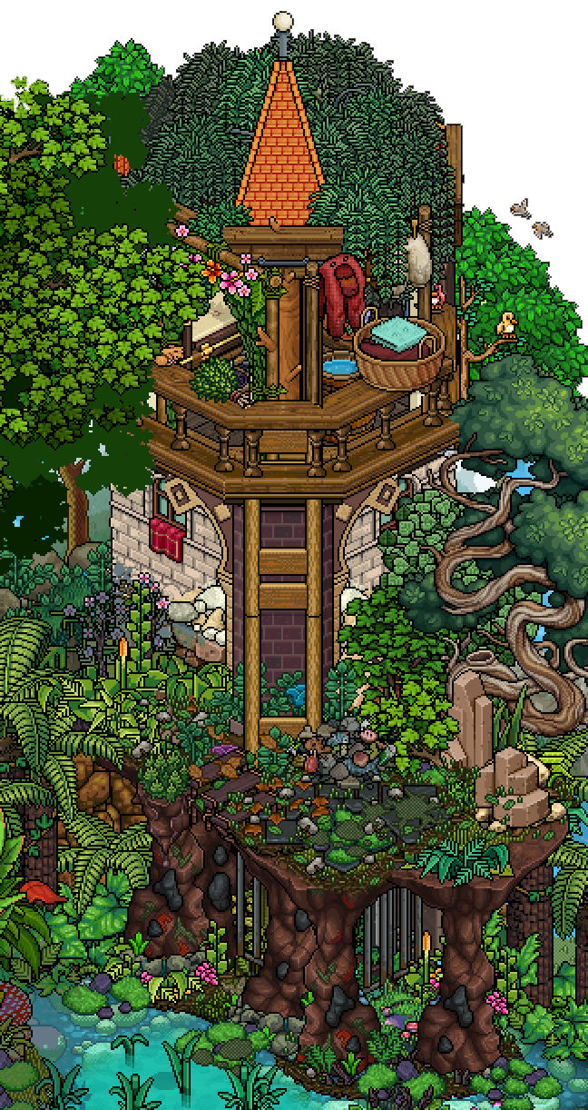

Anderge
Your theme was very interesting and I admire that you were able to incorporate so much thought and passion into your build. Your spin on an attic was crafty and unique to your building style. The tower looming over the lush landscape you created really told a story. Unfortunately, I don’t see as much of the attic as I would have liked. When working with an exterior build, it’s important to highlight the main focus of the task. Removing some of the exterior walls to showcase a little more of the interior would’ve worked wonders. In no world is this a poor build, it’s quite stunning. For this task however, it doesn’t meet the requirements as much as the other builds we received do. I’m sorry to say this will be where your story ends this season. Thank you!
You managed to portray quite the stunning room. Were this any other task or if it had any relations to it I would be all over this. The details on the nature surrounding the room are gorgeous and the room itself is quirky and cute. That being said, this room has the least connection to the task this week. It could be an attic but it is almost displayed as an afterthought. The focus shifts more towards the landscaping and the exterior construction. I wish the attic was more focused and brought forward. It is unfortunate because this is quite the room, it's just not what we asked for this week.

..Raymond
Impeccable! In my opinion this is one of the best first submissions we’ve received in all 4 seasons of BuildersCorp. Your ability to create the illusion of an attic through the use of the beams is fantastic. A peculiar shaped room, highlighting the importance of this task. The details aren't overbearing or mundane, they fit the space quite well and enhance your theme. Overall, a compelling design worthy of our competition. I'm excited to see where you go from here.. I think we all are. Welcome to BuildersCorp. 4!
What a splendid display! I am shooketh. This room did what the task required and so much more! Spectacular play of space and layering. The composition in this is to die for especially with the way you complimented that with such stunning use of colours woven throughout the room. It is one of the best rooms of the week. You do know how to make an entrance. Welcome to the competition.
Queenension


The overall construction is a tad overstated and unnecessary. If you scale down your builds I guarantee you'll be shocked by some of your more technical choices. They will stand out a lot more. However, this is a great start to your journey. Your attic is faceted. The bed you created is quite intriguing, I would like to see some more stacking like that spread throughout your builds going further. Overall, a simple yet fitting rendition of our task. Try to hone in on what it takes to be a top contender and you'll climb your way to the top in no time. Welcome to the competition. Good luck!
A cute starter submission. I do enjoy the way you composed the details in the interior keeping an eye on color and balance. The potential is definitely there. With that said, I would like to point out some things you could do to improve your standing in the competition. This room could have benefited way more if it was… less complete in a way. Let me explain. In this competition you don’t need to make a fully complete, functional room with an aim to be a visitable place. You need to focus more on an idea, a graphic display of that one unique idea you think of, showcasing it in the most dramatic way possible. It doesn’t need to have everything from every wall resolved to hints of exterior etc. If you do add those make sure they have purpose and enhance the initial focused idea you started with. Look at some of the other rooms in the panel, some did less work than you and still show a way better presentation. What I’m saying is let go of your principles of what a room is and evolve your canvas. Be bold, be spectacular. Avoid symmetry and put your best foot forwards. Welcome to the competition.
Congratulations ..Raymond on becoming the first builder in season 4 to win a task. Your building style is phenomenal. You're a force to be reckoned with and we can't wait to see what this competition has in store for you. Good luck.
Unfortunately this competition bids farewell to Anderge. She returned this season with a vengeance and 1 bad week sent her and her toolbox packing. We would like to thank her for all she does in our little community. Keep building and sharing what you can do!
Thanks builders!