MUSEUM
MUSEUM
Week 4
Welcome Builders
Welcome to Week 4 of Builders Corp. 4.
Your fourth task requires you to create an exhibit for a museum.
We urge you to really get creative. Show us an exhibit YOU would be excited to see.
This week we ask that NO BOTS be present in your design.
Good luck builders!

Congratulations
Riverfire

Congratulations Builders! You have successfully completed your fourth task. We want to issue a special thanks to those builders that have really embodied the essence of our competition. Builders Corp. is an outlet for builders to express their creativity. We invite and cast tremendous talent every season, in the hopes that each builder is able to excel in this competition and inspire future builders. The fun that is created in the process is entirely up to you. Each week every builder is ranked based on their stacking abilities, creativity, theme and overall appearance. Each and every one of you left in this competition has what it takes to coin the top spot. Don't doubt yourselves. Let's have a strong finish to this competition! Please see the progress page for your individual ranking. Thanks!

EarCandy


Brilliant. The shape and appeal of the design is quite enthralling. The way you curved the roof and combined the beams to fit the space is really amazing. The display cases are packed with so much detail. The windows you chose to use, allow for us to see exactly how much detail you put in this space. Your decision to show underground, the degrading bones. Lovely. One of my favourite details in this build was your ledge that you created around the perimeter of the exhibit. Overall the space is packed with so many details that elevate the theme of this weeks task. You really bounced back this week. Keep up the amazing work!
I’ve been waiting for you to finally show your true skill we knew you had in you. This creation is gorgeous! The room envelops you completely in its aesthetic and story. This is helped by the gorgeous controlled palette and the structure of the room. The exhibition is highlighted perfectly in its bright colors contrasted well with the darkness surrounding it. Nothing is amiss, everything is in its right place and the end result is an overall feeling of fulfillment.
Riverfire
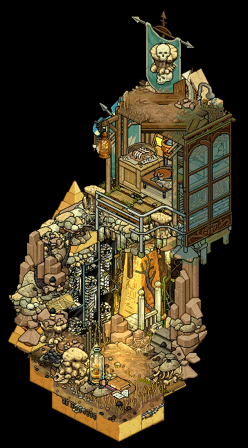


I can picture this exhibit being displayed in an actual museum. The scaffolding and beams set up to freeze this moment in time. Glorious. The layered design, separating the excavation site from the rest of the build, nicely done. The shape of your build is the most unique we've seen this week. It told your story quite well and allowed us to capture your theme. The intricate detailing you worked into this is exceptional. Each time you look at it you pull more detail out of the design. This is your best build of the season. We are so excited to see where you go from here. Good luck!
My absolute favourite room of the week. This room perfectly captures the fantasy of this task especially when you reinforce it with an immaculate colour palette and spectacular structuring. It is one of your better creations on this entire season so far and I’m glad I got to experience this room. Keep it up
Deactivate!


The displays you created within your exhibit are so well detailed. They fit your Egyptian theme so well. You incorporated so many elements that allows us to grasp exactly where you were going. The mummy laid out with a photo, rocks from a site excavated and fossilized in a case. Beautiful. The only thing lacking in this design is the shape of the room. Had you found a more inventive way to display your exhibit, it would've elevated your design. Think of ways to add height or different focal points. This will allow us to see the detailing more clearly. Overall, this is very well done.
A quaint room with a set palette that immediately tells you the subject of the room. The details displayed are immaculate and the overall organization is very cute if not somewhat less exhibitiony, more shopey. It certainly lives up to the fantasy of the theme. I do wish you worked more on structure and walls though. Next time do try to show us an approach on dimensional/structural spaces to frame your room and not just a simple boxy pair of walls.
Queenension


I'm obsessed with your theme. A clean, crisp display of renaissance garb. Beautifully displayed in a modern case, fitted with appropriate lighting. I can definitely see this in a museum. The gift shop was a lovely touch, as well as the modern flair you worked with in the aesthetic of your build. I feel as though you could've pushed some of the detailing. Perhaps adding more textures in the modern aspects of the design, it would've tied it back to the period a little bit more. Incorporate some unique stacking and furniture combinations. We want to see it all! Overall, this is really great. Keep up the good work.
I can practically smell all the hard work that went into finding this collection of furni to complete your display of clothing. It is immaculate! That being said, I personally feel like you focused way too much on the display and not as much on the actual room building. Like I said the display is fantastic, I can't fault you there, but do keep in mind that we were looking for whole rooms in general and that certainly is lacking here.
..Raymond


Not only were you able to work an abstract theme into your build, the structure surrounding your art are abstract as well. Very clever. The use of shape and lines really play to the modern aspects you worked with in the build. The line on the exterior wall connecting with the pillar as well as the lines going vertically to the ceiling and cutting across. Wicked. Your attention to detail is very precise and the work you incorporated into this design is quite the work of art as well. Overall this is a very strong build for you. Nicely done.
I very much like how you focused on structure and architecture over the actual exhibition. Somehow it works perfectly well. Yes, we can see you showing modern art compilations but they are somewhat secondary subjects compared to the amazing building they’re displayed on. I want one of these buildings irl pls. Great work as always with an eye on complex shapings and detailing.
Deathbrand


This design is very fun. It's colourful, refreshing and holds a lot of interesting details. I really enjoy that you created the works of art by combining furniture. It really allows us to see your creativity and how this task inspired you. The modern flair works in tandem with the exhibit you created. The stairs leading to the upper floor are built well, the pops of colour sporadically placed in the design are intriguing. Overall this is a great composition and it really speaks to your personal building style. Good work.
You’re one of those builders where you can immediately tell who made the room at a glance. You have a bizarre way of mixing up stuff that others would never think of touching, sometimes it looks impressive, sometimes it looks a bit bland. Structurally this room is great but some of the details in it kind of throw me off compositionally. I do think there’s a better composed version of this room with some adjustments of the details but overall I like the subject of your exhibit. I certainly love the chaotic energy on the lower level.
C0RPSES


Minimal yet very impactful. This is leagues away from what I expected anyone would submit this week. I'm so glad you did. The liberties you took in creating an exhibit that focuses on political injustices are not lost on me. The space you created tells the story masterfully. The layering in the walls with the use of windows and frames is gorgeous. The textures and palette you used to portray the space was appropriate, and the shape of the overall room is interesting. Well done!
What a bizarrely appropriate room you’ve made. Since your usual memo is adding as many details as possible, the minimalist approach here contrasts too well, especially with the context of your exhibition but also with this current task. It perfectly highlights the subjects showing and the overall take on the room is quite artistic. This room does show your ability to adjust your creations to fit almost anything we shoot at you. I am thoroughly impressed.
Congratulations Riverfire on your first task win! You're climbing the ladder in this competition. Showing each week, why you deserve to be here. Keep striving for those top spots. Well done. We say goodbye to Qamel. and OdeyasH. Both of which decided they would no longer like to be in this competition. Thanks builders!